|
<---MY FINAL PRESENTATION!!
| ||
Final Reflection!!
This semester of art has changed me a lot. I have learned a lot about myself as an artist and a student. I started out not sure what I was doing or what I was capable of. I knew that throughout the semester we would have to create all these concentration pieces in a short about a time. Looking back onto this past semester I could see how much I really grew as an artist. I started out with different mediums like prisma and pencil, I soon realized that those materials aren't my style. I always knew deep down that I loved acrylics more. I started playing with that medium I found my true style. Watching how way through as an artist is weird to think of but an amazing feeling. Through this class I have figured out my comic book like style that makes me a truly unique. By exploring the new style I found different levels of my own creativity and love for art. Without this class I would've never been able to find my new style and grow more as an artist which is what I want to do for the rest my life.I love how everything turned out within my concentration and I am so proud myself for how I have grown as an artist and how Miss Rossi has pushed me to get there. I feel like now I have really grown enough to get even better at art in my future at NC State. I can’t wait to apply something that I love so much (art) into an actual career in order to what I love for the rest of my life. Thank you Miss Rossi.
This semester of art has changed me a lot. I have learned a lot about myself as an artist and a student. I started out not sure what I was doing or what I was capable of. I knew that throughout the semester we would have to create all these concentration pieces in a short about a time. Looking back onto this past semester I could see how much I really grew as an artist. I started out with different mediums like prisma and pencil, I soon realized that those materials aren't my style. I always knew deep down that I loved acrylics more. I started playing with that medium I found my true style. Watching how way through as an artist is weird to think of but an amazing feeling. Through this class I have figured out my comic book like style that makes me a truly unique. By exploring the new style I found different levels of my own creativity and love for art. Without this class I would've never been able to find my new style and grow more as an artist which is what I want to do for the rest my life.I love how everything turned out within my concentration and I am so proud myself for how I have grown as an artist and how Miss Rossi has pushed me to get there. I feel like now I have really grown enough to get even better at art in my future at NC State. I can’t wait to apply something that I love so much (art) into an actual career in order to what I love for the rest of my life. Thank you Miss Rossi.
LAST CONCENTRATION PIECE AGHHHHH
For my last piece I knew that I had to do something that I have never done before. I asked my class which time period I missed or would be cool to put in my concentration. Most people said to either do some type of Asian culture or do the 80s. I always knew that I wanted to do the 80s as an art piece but I never had a good enough idea to actually paint it. Brainstorming these 80s ideas were more difficult than I thought. I had ideas of a concert or even a teen bedroom, I was all over the place. Then I had the idea to do prom because not only is prom right around the corner, the fashion of that time was so outrageous I could be as creative as I want with it. When I think of prom from that time, I think of the corny couple pose behind the plain background surrounded by balloons and streamers. I wanted to change the couple dynamic up because prom to me isn’t just about having a boy, it’s about having your friends with you too.
The process of painting went a lot smoother than my other pieces (maybe I have actually gotten better!!). The most difficult part of this project was the mouths of the people. I didn’t realize that I have never really done anybody smiling with my style. It was hard to not make the smile too big or look fake. I finally got it right after the third try or so. The most fun part about this project was creating the look for each of the girls. Dresses at this time were so over the top and each dress was unique. Some had bows and slits and others were short or long. With all of these different options, I could be even more creative with the dress designs. In the end I am super happy with how everything turned out.
This was the perfect project to finish with my senior prom coming up and realizing that high school is almost over. Then finishing my LAST concentration piece really brings everything to light.
Eleventh Concentration Piece- Modern Red Carpet
For this Concentration piece I thought it would be cool to do something with today's fashion. I love looking at all the different celebrities on the red carpet and seeing what they choose to wear. Sometimes you get some crazy outfit but other times you get really simple yet fabulous looks. I wanted to create one of those looks but do something I have never done before. I wanted to use glitter and a lot of it. I wanted the dress to have fading glitter down the dress with paparazzi in the background to complete the celeb look.
After researching the different red carpets they had I loved the met gala carpet the best. They had all the paparazzi behind some kind of bushes that border the carpet. I loved it because I could use that and incorporate nature into my piece without having it look out of place. I could also use a pressing technique that I love to do with sponges to create that texture for the bushes. Then behind them was a simple off white curtain and I knew that could make the dress really stand out. Painting that part I was unsure because I thought I made the curtain too yellow, but after adding the lines that really helped the yellow tone and created the simple look I wanted. At first when I had the glitter fade on the dress it looked horrible. It made it all look fake and incomplete. So I decided to just make the entire dress glitter and I do not regret that at l because I love that even more. I even added more gold glitter to create the earrings and the shoes. In the end I fell in love with this piece. Even though I didn't turn out exactly how I pictured it, it looks even better than I thought and I am glad I created a modern one that I would wear on the red carpet!
Tenth Concentration Piece- Greek God Party
This project idea was one that I definitely had in my mind for a while. I knew that this piece would take me a while and that I would want a big canvas for it. I knew I wanted a bunch of the gods basically having a party up on Olympus with a ton of food. Figuring out who was gonna be what god was difficult because I wanted each one to actually relate to one of my friends. For example I made my friend Michael phosiden because he is a swimmer and he loves the beach. After asking dozens of questions I figured who was gonna be who but I had no idea what they would wear or where they would even be. Good lord. I had to design what 9 gods would be wearing and have them all be unique because no god would wear what another is wearing!!
Painting this wasn't has hard as I thought it was going to be. The hardest part of this piece was mainly the time consuming details I wanted. From the food to the clothing to the columns. This project was a lot of work. In the end I had to go back to the columns to add the vines and lines because they were too distracting from the people and all the details. This was difficult because I didn't wanna smudge those things in everything I already completed. Then with the people I had to think of different color ranges for each one and also think of little hints for what each one was (rainbow sash for Iris, bow and arrow for Artemis, owl for Athena, etc.). But designed the flowy wardrobe was a lot of fun because I would defiantly wanna wear all of their clothes!! In the end I am very proud of this massive project and all the details within it. I am so glad I did this project and I am happy with the end result.
Ninth Concentration Piece-Futureistic Friends
For this project it took me a while to pick which idea to paint. I had such a mix of all the different time periods in my head and I couldn't pick one. I asked my friend emma which one would be the most interesting but fun to create. She thought that the future would be a cool one to do because I could create all of the elements of it on my own without any real life references (besides movies lol). I agreed that that one would be cool. When I think of the future, I think of movies like treasure planet. There are all sorts of creatures and humans living together and traveling through space with the help of highly advanced technology.
Since I have done just one person in my recent projects I decided that I should do 2 people in this piece. I decided to do me and one of my best friends Maren because we both love the movie treasure planet and that is where my space inspo is coming from. There is a part in the movie where the main character unlocks this orb that reveals a technological map in mid air that takes over the entire room for everyone to see. I bounced off of this idea and had one of the people with something like it coming out of her hand. I knew I wanted that part of the project to be bright neony colors because that is how I see the lights in future technology. The fashion for the future isn't created yet, but if I could think of it these tight superhero like colored suits would be it! At first thinking of the colors were difficult because I didn't want anything brighter than the technology but not dark enough to blend into the background. I tested different colors in my mind but blue/white and green/grey seemed to work the best. In the end, I am very proud of this piece and I am very happy with the ending result. Knowing I thought of everything in this piece is satisfying too because I was my own resource.
Eighth Concentration piece- Brother and his partner as a cowboy
For this project I decided that I wanted to do my brother in law Alex. Alex is a police officer and is known for not only being a daredevil, by for his best friend (his dog) Lexi. When I thought of daredevils through time, it was hard to not think of the cowboy. I decided that I would do that because it would be easy to also incorporate Lexi in there because cowboys used dogs to corral their cattle.
Starting this project was kinda difficult because I wasn't sure what was gonna be in the horse or what the cowboy was going to wear. As I got into the groove of painting, I was more sure of what colors I wanted. At first I had almost the shade brown for everything and that was really dragging the piece down so I had to play a lot with the different shades of brown for the rope, saddle, horse, and even the cowboy. I wasn't quite sure what I wanted the cowboy to wear so I put that off for a while up until I lined everything in black because i added little things such as pickets and wrinkles. Those details within the clothes really give the piece that little umph that brings it to life. Within the background of this piece I knew I wanted to do the different reddish canyons with the little desert plants throughout the plain. But drawing this was harder than I thought. I had to google different cowboy deserts to get the inspiration for the look I wanted. I decided to take colors from the canyon and create streaks of the colors across the foreground and vise versa with the canyons in the background. I love that I added these because I feel like it really ties them both together while also adding some little detail that I love. Then the plants throughout the desert were fun to paint because it was not only a color besides brown, I got to be creative with the shapes and details within the plant. In the end, this project was a lot of fun to create and I am super happy with how everything turned out within this piece.
Seventh Concentration Piece- Cousin as Marie Antoinette
For this concentration piece I knew that I wanted to do the Marie Antoinette style with the big dresses and big/grey hair. Sketching this piece was a lot easier than I thought at the start of this. After doing a lot of research on the clothing for this time period, I knew I wanted to combine the different popular styles. I got images from Pinterest and I got inspiration from watching a little bit of the movie Marie Antoinette. I knew exactly what I wanted to do with the girl but not so sure what to do with the background and the colors or everything. I knew eventually I could figure all of that out after I sketched out the layout of everything so I could really visualize everything in action.
After I sketched out everything I began to paint the wood from the chair/table and I decided to do a pale green for the dress because green is my cousins favorite color. After blocking out those colors, I decided that I would do a floral print design throughout the dress because this style was popular and I thought the detail of the flowers would really add dimension to the dress and really tie the piece together. At first I struggled with this because painting the flowers I thought they looked childish and too cartoony. I decided to add more flowers but with different colors because it would not only fill the space more, it will tie together all of the extra colors throughout the dress that I had painted so far. At this point I had the table painted out but I did not exactly know what else would be on it. After asking my classmates their opinions, one of them said that I should cake on the table because Marie was known for spending all of her riches on cake. I thought this was a great idea because I didn’t want the table to be empty but I didn’t want to paint a tablecloth because it could overlap not well with the dress. Then finally, within the background of this piece I wanted to do something simple because the dress was so detailed. I did a large floor curtain which was common for this time period and little detailing along the walls because that was common too. In the end, I am very proud of this piece. I love how all of the colors played out and that everything seems to fit perfectly. I can’t wait to see this piece in the AP art show at the end of the year to show everyone.
Sixth concentration piece-Egyptian Princess and her pet
For this project I started out with the idea of doing one of my sisters with her best friend (her dog) Akela. Their friendship and bond inspired me to think of a piece where humans and animals combine. My first idea was to do something ancient Egypt but I didn't know what to do with that. I had different ideas such as to do the desert or do some type of pharaoh. With my different sketches I decided that to do a queen with her pet was perfect.
I started sketching it and I knew I wanted Layla as the focal point but I didn't want her in the center of the piece. So I thought that hieroglyphs in the back would balance that out very well. That's when I thought about my dad. My dad used to travel a lot for his job so he would always get souvenirs everywhere he went. The last time he went to egypt he got these cloths with some of our family names in hieroglyphs. I knew that those would work perfectly in my piece. I decided to do I different center picture within the hieroglyphs because I knew I wanted to do people within the drawings on the walls. The other hieroglyphs on the walls were the hardest part of the project because they were so time consuming and I wanted to make sure they were perfect. I also googled actual symbols and used them in the wall. Another difficult part of this project was using the gold paint. I debated about using it for a while because I didn't want the metallic part to ruin my piece. That was when I decided to balance out the metallic part by mixing yellow with it when I used it for the throne. Surprisingly painting Layla herself was one of the easiest parts of this (maybe I'm getting better??). I loved adding the jewelry and figuring out her dress design to fit her body and the time period. I had a lot of fun coming up with the different styles to go with (I went simple because thats Layla duh). I am amazed by how this turned out and I can really see that with every piece I am slowly getting better and better at different elements that at the start of the semester I was horrible at (like people).
Fifth Concentration Piece
This concentration piece at first was a huge struggle. I thought it would be cool to do a couple roller skating but that was all I had. I didn't know what time period or even what position I wanted the couple in. I had the idea to do the girl on the guys shoulders because I thought it would be unique and fun to paint. At first I thought about doing something from the 80s with scrunchies and printed leggings. But then I thought about the position I had the couple in and I had a vision of the bright 70s color and style. I wasn't sure about what the background was going to be like either but I began to paint anyways. Because the 1 week deadline was coming soon. Drawing the position of the couple was one of the most difficult parts of this piece because I wanted the proportions to be perfect and I also wanted to the faces to be perfect. After drawing those, color blocking the different sections was easy. I decided to base this couple off of my sister and her husband. So I chose the colors red and blue for the guy to represent Spider-Man (his favorite superhero). Then I chose pink and purple for the guy to represent rapunzel (my sisters favorite princess).
After finishing the couple I began the tackle the background I wasn't sure of. I did a lot of research on different skating rinks in the 70s but they were all so plain in color. I knew I wanted something with more decoration and color. Then I saw a design of a rink and I thought to do the curved stripes. I painted those immediately for the rink border with the wood floor color as well. Then all of a sudden I was stuck. What am I going to do with this top part of the rink?? I thought of different designs and right fixtures I could put in the ceiling. I asked my classmates about what I should do and one of them said "you should totally do dots". At first I thought that was not only really time consuming but crazy. But after giving it thought I realized that it wasn't so crazy. I could easily do the dots and then put different light things on top of it!! I decided to do the black as the back because in a roller rink it is pretty dark out of the rink anyway. After painting that I began to do the dots. Those were a lot easier than I thought but they were really time consuming. After a couple hours I finally finished them. I fell in love with them. I loved the balance they gave to the piece. I finished off the piece with the texture to the striped walls using a towel and creating the wood floors with the black marker. In the end, I am very proud of the piece and I am obsessed with the style of it. I hope I can do more in this style with more variety of time periods.
Fourth Concentration Piece- 50s Diner Couple
The starting process of this project was a huge struggle. At first I had lots of ideas scrambling in my head and I wanted to do so many things and have different messages in the piece and blah blah blah. Luckily, Miss Rossi was there to help me by telling me to rethink all of my ideas. At first I was flustered but I finally calmed down and decided to go into my sketch book. I saw that I still have a list in there that I made at the beginning of the semester of different ideas. I starting looking at all of them and thought that I should do one of these because I thought of these when sky head was more clear. The one that stood out to me was a 50s diner. I had different ideas for this such as a dancing or even a concert. I finally got the idea to do a diner with a couple because it is such an iconic part of the 50s. As I looked more into the 50s I thought it would be cool if i tried a new technique to paint the scene. I wanted to try to paint in a pop art/color blocked format.
At first the sketch for the project was pretty easy because I already knew in my mind what I wanted it to look like. The hardest part of the project was the colors. As you can see in the pictures, I had a completely different color for the dress and the booth. Then I also had to think of what jacket I wanted for the guy. It was hard to choose between and letterman jacket or a leather jacket but I realized that the black jacket would help with the balance of all the bright colors. It was also hard to choose how to balance the use of red and blue as the diner theme colors. At first I didn't have the chair at he bottom of the piece but I am really glad I added it because it not only helped me with the guys legs (which were horrible for a while) it added more of the 2 theme colors together as one. Another difficult color for this was the background. I pictured this yellow color but I had no idea how it would look plain against the more bold colors. In the end, I am very happy with this project. This is honestly the most fun I have had with a project and I hope to do another one in this style because it was so much fun.
Third concentration piece- Hippie Beach Van
This concentration was mainly inspired by my family. Every year we take a week beach trip together where we rent out a house that's ocean front and we just vacation together. We have dinner together every night during this week and we spend the days tanning and playing on the beach. Then we also play all sorts of different board games after the sun goes down. Thinking about this vacation makes me want summer to come as soon as possible. Sadly, it is currently February and we are months away from summer vacation.
I knew wanted to incorporate my family into one of my pieces in some way. After brainstorming different time periods, I knew that I would love to do a seventies piece. But I didn't know what people did during that time. After looking around I saw pictures of the old Volkswagen vans. I finally found my connection. I could a van with hippies in it. The hippies could be my sisters. At first with this I wanted to do a concert/woodstock theme. But later I decided that a beach scene would mean more to me and the art than just a simple concert. As I was painting this I knew I wanted the van to be the vocal point, so I chose a very bright orange color with different colored scents for the designs on the van. When it came to my sisters painting their outfits was hard because it was from behind them and i wasn't sure what colors would go with them well. This project was a whirlwind of color and exploration of new ideas in the hippie realm. But this project ended up being a lot of fun to create and I am excited to see how my future time pieces turn out.
Second Concentration Piece- The Best Friend Flappers
For the second piece of by concentration I decided to do a 1920s flapper inspired peace. One of my best friends, Zoe loves this time period and the fashion that goes with it. Saw the picture of us from this past summer of us in a "candid" position. I liked the overall composition of it and thought it would be a good base to my new project. Planning out the rest of this was pretty difficult because I wanted to get the fashion part just right with the scene as well. I found dozens of different fashion pictures for inspiration but still couldn't find the right look for me or Zoe. After experimenting for a while, I figured that one of us should have a longer dress while the other one could have a shorter dress so it would feel balanced. Thought that Zoe and I could match by having the feather headband on each of our heads. Finally, after figuring out the outfits I finally pictured the perfect scene for this piece. It would be at a bar because this scene was very popular at this time and it would give off a good party vibe just like Zoe and I are.
The beginning of the project was horrible for me. I chose primas colors because I love the colors that I could do with them. I also I wanted to try something new again. (Because I have never done people with prismas!!) I started with the faces because I do those would be the hardest and I was right. After a while I got so stressed out with the faces I had to erase what I drew and concentrate more on the clothes in order to get my focus back on the face later. I chose the colors of the dresses based of the colors of our actual prom dresses from Junior year of high school. I got bored to the groove of the project I started to have fun with it! I loved creating the curves of the fabric and just having fun creating my friend and I into a time period on paper. Later on when I finish the clothes, I knew it was time to do the faces. Asked one of my classmates for advice and she told me to really just look at the shapes of the face and to not focus on the details. With this advice I was pretty successful with the faces. I do want to work at the board the future but for now I am proud of what I created.
First Concentration- WW2 Couple
For this first piece I decided to go very simple. I got the idea from one of my best friends Zoe. We were bouncing different project ideas to match our concentration and I explained how I loved the fashion through WW2. Then an idea suddenly popped into our heads. At this time soldiers were leaving to go fight. There are dozens of iconic pictures of soldiers with their girlfriends kissing. I wanted to create one of my own with a couple in our group. When I thought of an iconic couple it was hard not to think of my friends Brooke and Justin. They have currently been dating for over a year and they are crazy about each other. I decided to do this project in pencil because I have never really done one before and I wanted to create the classic black and white photo look for the piece.
The start of this project was very difficult for me. I have never drawn a profile of people before and I haven't worked with pencils. I did a lot of research on this time period and the different iconic kissing pictures. I finally figured out that I wanted a picture of them kissing from a train. I knew that trains were popular at this time and I could also incorporate perspective into my piece (I love doing perspective drawing I think they are super fun to create!). I thought to do the man in the train because it would really show that he is leaving the woman behind but they still have a love between them where the people around them do not matter. After I got the faces done, I realized that pencils wouldn't be as easy as I thought it would be. I have to create dozens of different shades just by using one pencil. By planning out the different colors and textures, I figured out each event of my piece. When I finally finished this piece I was proud. I have officially created my first concentration piece with a medium I have never used. I can't wait to start my other projects and truly bring my concentration to life.
First Semester Reflection
This semester of art has changed me a lot. I have learned a lot about myself as an artist and a student. I started out really nervous about what the semester is going to bring. I knew that throughout the semester we would have to create all these different pieces in a short about a time. I was nervous about completing the different pieces to their fullest potential in this short about of time. Of course on the first day we went over all the different types of projects we would complete from a self-portrait to a pet portrait. My nerves soon began to build up because I have never tried to draw people or animals in my life. I knew the new semester was going to bring a lot of struggles and that all I could do was push through.
Looking back onto the semester I could see that I semi over stressed myself. But this semester did bring some struggles. Drawing and painting people for the first time was one large challenge. I knew that if one thing went wrong the project wouldn't even look human. Then I also got to try new mediums such as oils and my own set of prismas. Even though I ended up not liking the oils, I'm glad I got to learn how to use them. They are fun to use when it comes to creating a variety of colors and textures into one piece. Then I also got my own personal set of prismas. I played around with them through the summer but I never did a project on them. Now I am currently working on my third project with them and it's amazing. I am learning more and more with every project I complete and that is why I am taking this class. This is teaching me all of these different skills I am going to need going into college and I am really glad I signed up for it.
Nature Turns Mechanical Project
This project was one of the most difficult projects I have ever done as an art student. When we got assigned this project I had no idea what to do. I had an idea to do something with the maps but that idea eventually fell through. Over the thanksgiving break, I had to work on this project that I had to start from scratch. I have already done this project in my past art 3 class so no ideas were coming to me. I didn’t even know what medium I wanted to start with. This frustrated me a ton because I wanted to work on the project but I didn’t have the idea to work on it with. I went to my parents with my project problem and I begged for their advice. My dad got up and decided to show me something. He had all of these pieces of gorgeous different hardwoods. He explained to me that he already sanded them down and added some stuff on it so that you would be able to paint on it. I stared at the wood for a few moments and I got an idea within the shape of the grain.
I decided that I was going to do a submarine under the water that was also in the shape of an animal. I decided to do a seal because not only are they underwater creatures but they are one of my favorite animals. I started painting it with acrylics because I would rather use the paints that dried faster on the wooden surface. As I was painting the different layers I started to hate this project. Nothing was turning out the way that I wanted and my frustration came back. I had to walk away from the piece for a couple days because it angered me so much. After a while I decided that I should just yet again start this project over again. I still liked the wood element that could play into the nature part. I flipped the piece over and decided to think of new ideas for the back. Still thinking about what to do, it was pretty late at night. I was the only one in my house fully awake. I decided that it was time to go to bed and that I would think of more ideas tomorrow. As I crawled into bed, I looked out my window into my backyard which is mostly woods. I saw the full moon shining bright over the trees and I saw how peaceful everything looked. That is when it hit me. I knew what I was going to paint and it was going to work this time.
I started with one of my favorite shades of purple with dabs of black and navy to create the night sky background. I meshed all the colors together to create the cloudy mix of colors. Then I splattered white on top of that to create the different stars in the sky. After that I painted the white circle to represent the moon. I decided that the moon should somehow be mechanical because I wasn’t sure how I could make the trees mechanical. I painted different pieces of paper with different shades of gray and white. I cut the individual pieces of paper into different gears and screws to create the mechanical moon. Then after that I used different shades of green with sponge brushed to create the trees going upwards into the moon. As you can see this project was a rollercoaster of stress and starting over. But in the end, I am glad that this project is over with and that I had something to present to the class.
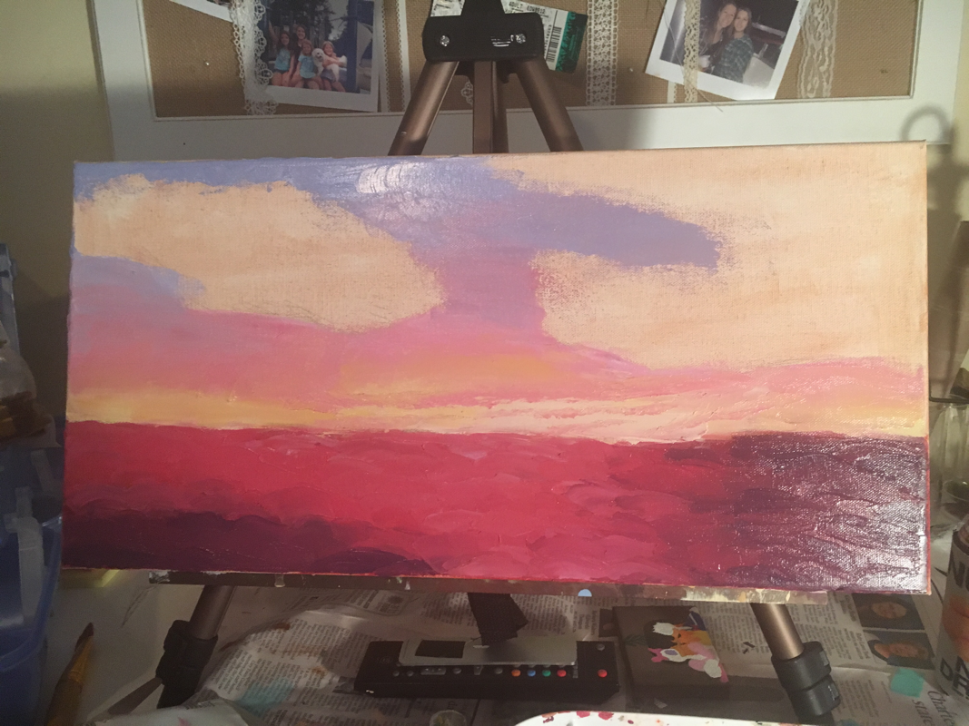
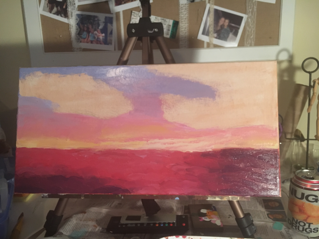

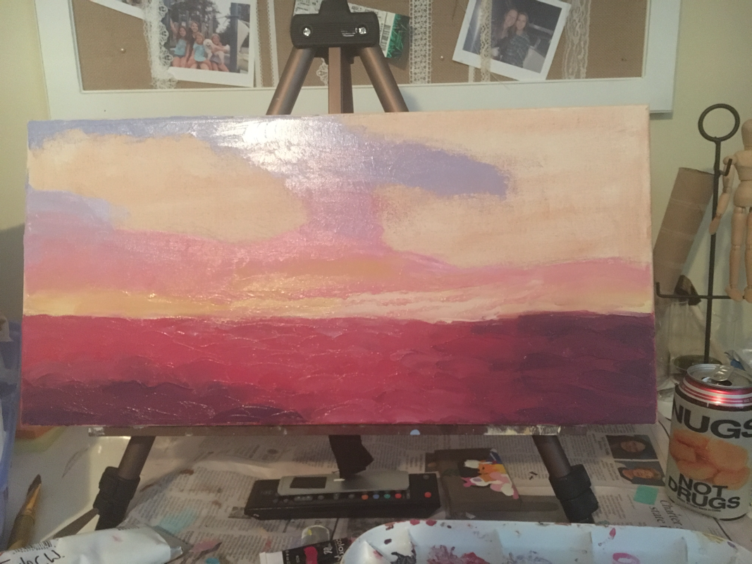
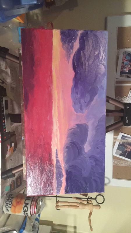
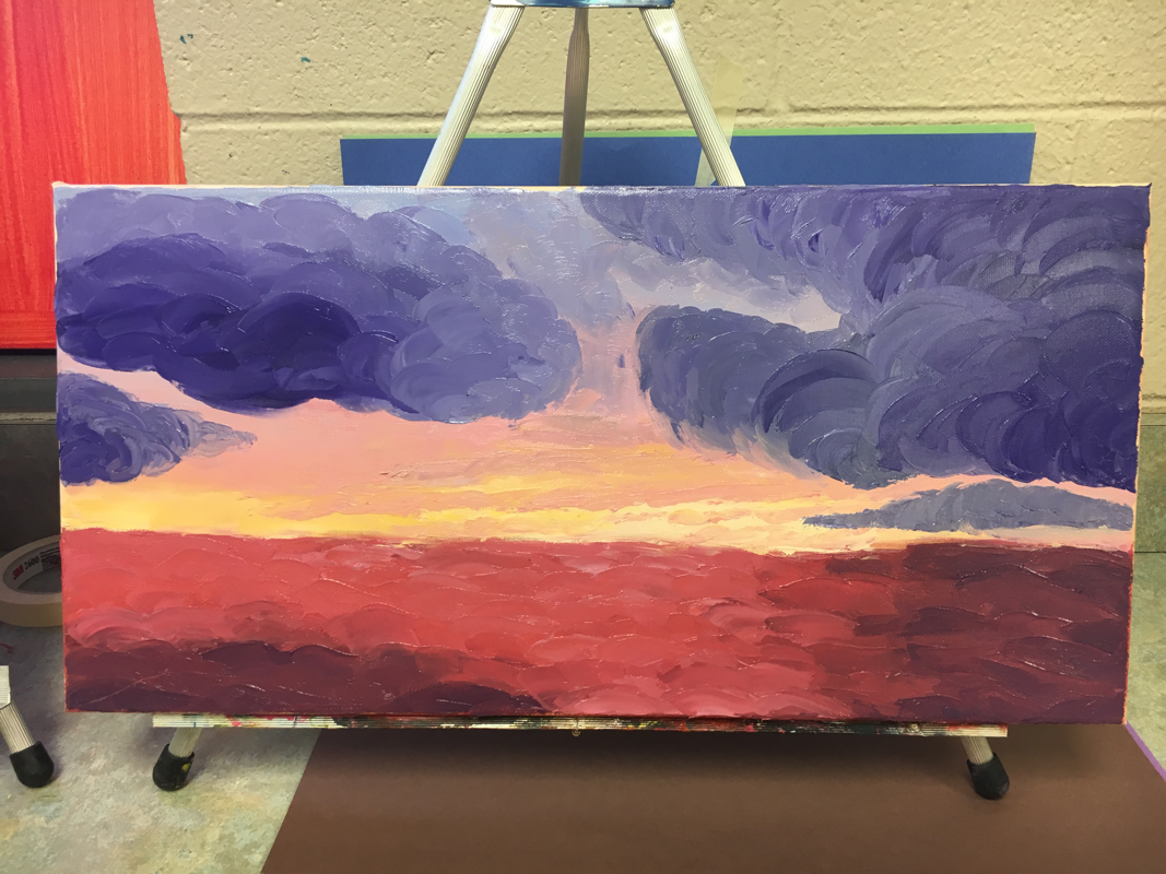


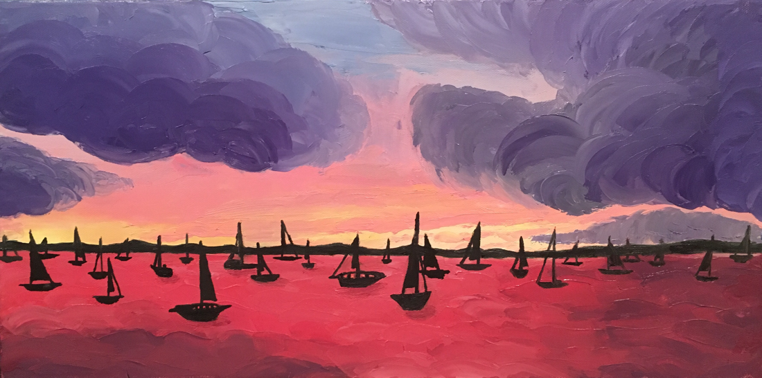
Landscape Project
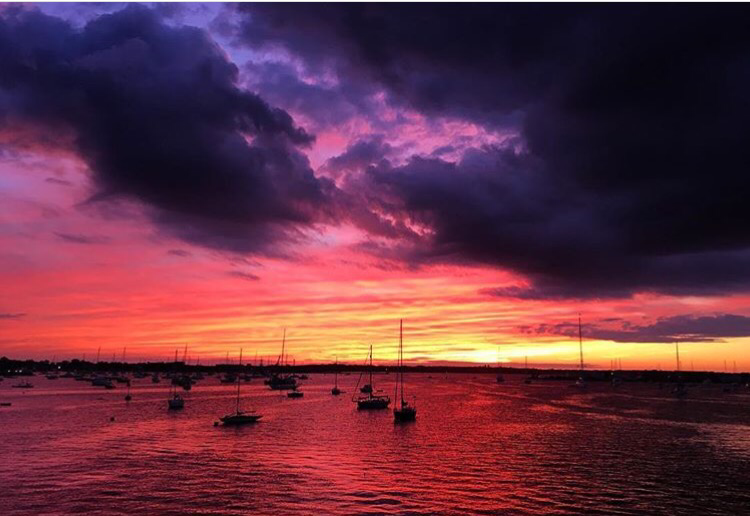
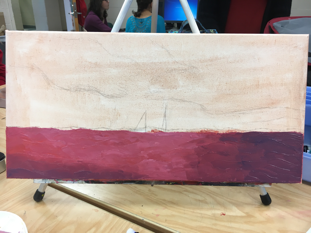
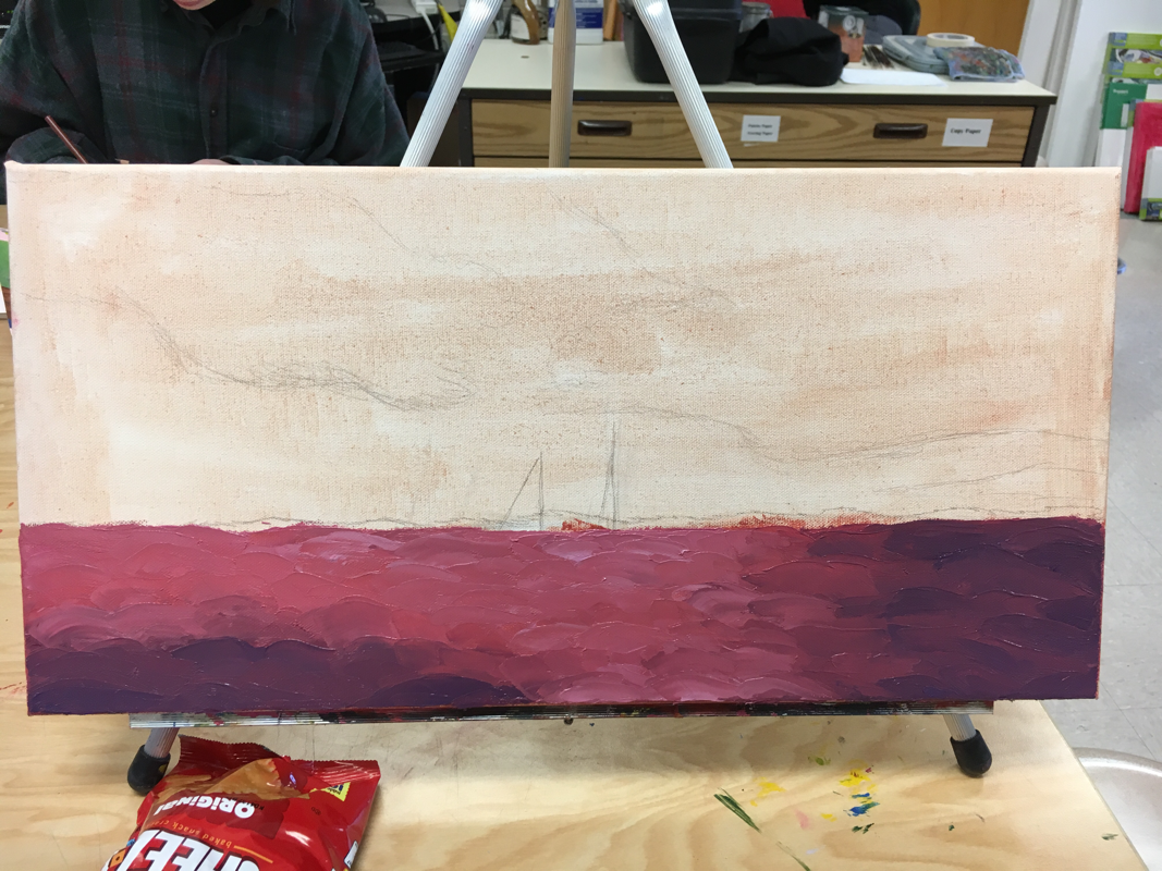
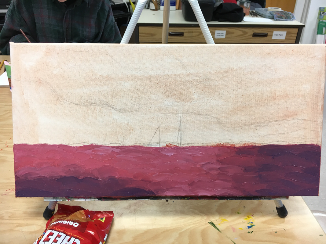
For the landscape project I didn't know what I wanted to do at first. I didn't have any cool pictures of landscapes. My classmates had pictures from all these different parts of the world that they visited but I have barely been outside North Carolina. Then I got the idea to get a picture from my cousin. My cousin Nikki worked on a yacht over the summer and got to travel all around the US. Now she currently has a job in Europe doing the same thing. Her Instagram is full of all these different exotic places. I decided to use one of her pictures for the project. I chose a picture that was taken in Rhode Island when she was leaving the dock. I chose this piece because I loved the vibrant colors that usually aren't seen in nature. Then that's when I decided to do my least favorite medium of all...oils.
I think this project turned out very well. It is only my second time using oils and it is my first time using the pallet knifes. I actually had a lot of fun doing the different colors and textures with the knifes and not being so rigid about detail like I usually am. One of my favorite parts about this are the cloud because I love the color purple but I also like how the pallet knife created the fluffy curves to shape the clouds and shade them at the same time. If I could redo this project I would probably work a little more on the boats because I feel I could marry the piece better if I added more things to them.
Even thought this project started out with stress on stress, I am happy with the final result I created.This project was a lot of fun to create and it was a good start to my future in oils and pallet knifes.
Pet Portrait
For this pet portrait I decided to do my dog pumpkin who recently passed away last month. I knew that within the piece I wanted to make sure that pumpkin was the star and that I would have it at a place she loved. In the original picture, my dog is on the beach and my leg is in the picture. I knew hat I didn't want to do my leg in the picture because it didn't really look like a leg and I feel it would take away from pumpkin.
Some of my biggest challenges through this blog were the eyes, fur, and the background. It was hard to decide what to do for the eyes because In the original picture you can't see them and I knew that if I drew them like that she would look evil. After looking at examples of dogs and practicing, I finally drew them on her and they are actually one of my favorite parts of the piece. Another challenge was the fur on her. I have never done fur before and on top of that she is white. I had to put colors in it that I never thought could work with her. I put greys and browns with pinks and yellows then I topped it with white. After a while I got into a groove and started getting the hang of the fur. Finally with the background I knew I wasn't going to do a beach. But I knew I also wanted a place that pumpkin and I both loved. Should I do my yard?? Or maybe my bedroom?? Then it came to me. I should do my car. Pumpkin and I loved car rides together no matter where we were going. After I finally figured out the background, I had to figure out the colors. My car is originally tan but I knew tan would drown out the colors of pumpkin. So I decided on reds and greys to bring out her collar and deep tones of her fur.
Overall I think this piece was very successful and I think I really captured pumpkin and how great of a dog she was. If I could hänge anything I would work more on the fur and adding even more dimension to it and making pop off the page more. I'm so glad I did this piece and I can't wait to give it to my sister for Christmas in honor of pumpkin.
Self Portrait
For this self portrait project I really wanted to send a message. A couple weeks ago it was Apex High Schools homecoming and I was voted by my class into the homecoming court. This was a complete shock to me because I didn't even know people knew me or thought about me as an example. At first I was super nervous about it because none of my friends were on the court and I wasn't good friends with anyone on it. But being that dress and having people tell you that you look beautiful in it made me really think. I wanted to show people that beauty is deeper than just looks.
This project had a lot a lot struggles with it. I have never done a detailed face like this before so just sketching it out was a huge problem. I have also never painted hands before so this was another struggle for me. This project consisted of a lot of first times so I decided to do a medium that I was more familar with (acrylic paint). At first trying to get the skin tone color was difficult because I realized it was looking more yellow but then I started to add too much red so it was a constant battle between colors and getting it just right. Overall I think this project turned out great and I think I grew a lot as an artist just from this one piece.
Interior Spaces
For this project I got the idea of a wedding dress shop from a picture I took a couple of years ago for my sisters wedding. While we were shopping for her dress I took a picture of a dress that I fell in love in through the window. I ended up loving the composition of it so I decided to paint it. My biggest struggle with this was figuring out how to incorporate other colors besides white into the picture. I didn't want to have a bunch of plain white wedding dresses everywhere. I really got to show my creative side with the colors and I ended up loving it. This project was a lot of fun especially because I want to go into clothing fashion when I go into college.
For this project I got the idea of a wedding dress shop from a picture I took a couple of years ago for my sisters wedding. While we were shopping for her dress I took a picture of a dress that I fell in love in through the window. I ended up loving the composition of it so I decided to paint it. My biggest struggle with this was figuring out how to incorporate other colors besides white into the picture. I didn't want to have a bunch of plain white wedding dresses everywhere. I really got to show my creative side with the colors and I ended up loving it. This project was a lot of fun especially because I want to go into clothing fashion when I go into college.
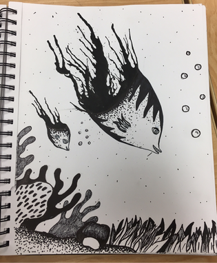
Inktober project
For this mini project in our sketchbook we went to miss sudkamps room to learn about inktober. Basically, you put some ink in a straw and you blow it on your canvas. You take the splatters and create a monster out of them. This project is really cool because you can super creative with it and every monster is unique. It was cool seeing the Art 1 kids do this because they were so judgmental about their own work. They wanted every line to be perfect and look just right but that's not what art is. Art is making those mistakes in order to learn more about yourself and your own personal style. When my mentee was having trouble I told her to take a der breath and look at her painting without even thinking about it. Just do what you think it looks like and the picture will come together. If it doesn't come together, you know how to do better on the next one.
Object painting
For this project we had to choose an everyday object. For a while I thought I was going to flowers or even snow globes. But then when I was digging through my backpack I found my EOS chapstick and it clicked for me. I was going to do a bunch of these chapsicks. I use these everyday and the colors of them are really interesting and unique. The main challenges of this project is that these were oil paints. I have never used this medium before and I didn't know how it worked. According to Miss Rossi I kept painting them like acrylics. I didn't know what that meant because how else could you paint?? With each EOS I accoumpished i got into a groove of what you mad to do with oils. You have to put in your darks and lights and blend them together. But this was even more of a challenge for me because oils NEVER dry. If I wanted to add a color I would add it then the color would disappear because the paint wasn't dry. So overall this project was stressful but in the end I got the colors and textures that I wanted across the painting. I now a feel a little bit more prepared for my next oil painting
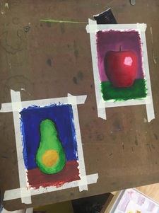
Oil Practice
These 2 fruits are my first pieces using oil paints. So far using oils is really cool and simple to use. At first I kept painting them like acrylic paints and trying to make the paint as perfectly smooth as possible. The next day, I decided to try to loosen up a bit and really use the brush on the apple to create different lines that wouldn't usually be on an apple. Then I started to get into a groove and I figured out the style I wanted. Then when I had to paint with the pallet knife it was hard to create the small details I am so used to focusing on. I love oils now because it creates so much depth within a painting and you can create all different textures and colors. I can't wait to start an official piece of art with the oils for my portfolio and I hope I have just as much fun with it as I did with this practice run.
These 2 fruits are my first pieces using oil paints. So far using oils is really cool and simple to use. At first I kept painting them like acrylic paints and trying to make the paint as perfectly smooth as possible. The next day, I decided to try to loosen up a bit and really use the brush on the apple to create different lines that wouldn't usually be on an apple. Then I started to get into a groove and I figured out the style I wanted. Then when I had to paint with the pallet knife it was hard to create the small details I am so used to focusing on. I love oils now because it creates so much depth within a painting and you can create all different textures and colors. I can't wait to start an official piece of art with the oils for my portfolio and I hope I have just as much fun with it as I did with this practice run.
Reflection Project
This project didn't start out like any usual project. Usually when I hear a theme for a project and I think of a list of ideas there is one that stands out to me and that is the one I decide to do. This time out of my list I had 2 ideas that I LOVED. I could decide between them. These ideas for the defection were to either do a carousel ride that I did over the summer with my cousins or my sewing box with all the different tools inside of it. In the planning process I printed over a dozen reference pictures and did 7 compositional sketches with a mix of both ideas to finally figure out what I wanted to do. I ended up picking to do the sewing box because I fell in love with the composition and variety of colors I got to play with within the piece.
This project turned out as what I think is my best prisma color piece I have ever done in my life. I finally figured out my system to blend the different greens within the folds of the fabric and get the colored shape of the pins just right. If I could change anything about this piece it would be to add more utensils within the box such as more spools or marking tools. Otherwise I loved this project and I hope I can work with prisma colors again so I can get even better at them.
